James Ready
Services
- Brand Strategy
- Identity Design
- Typography
- Package Design
- Copywriting
location
- Canada
James Ready
Rebranding a 100+ year old Canadian icon, for the modern consumer and old faithful, alike.

Rebrand
For over a century, James Ready has been an iconic presence in the Canadian beer market, passed down from one generation to the next, almost as if it was a tradition. The problem was the brand felt dated, and JR was looking to increase market share nationally by attracting a younger demographic of beer drinkers, while remaining true to their loyal drinkers.
Our mission was to leverage the brand’s rich history and develop a unique and distinctive identity for JR.
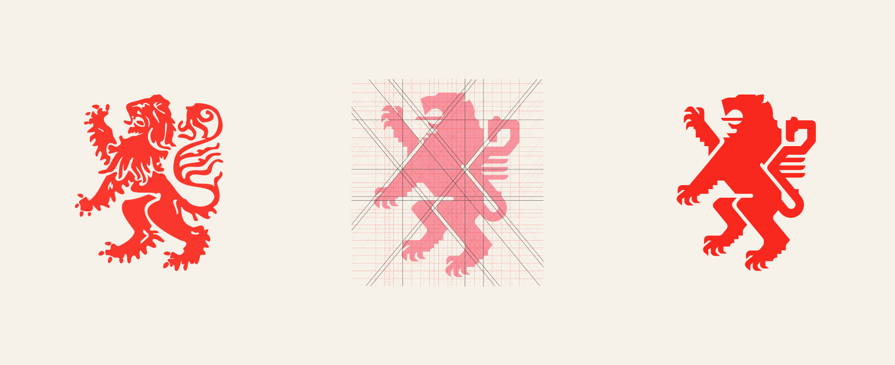
We began by stripping away the non-essentials, leaving us with the Scottish Rampant Lion—the heart of James Ready. We then distilled the lion to its core, employing circular geometry contrasted by sharp edges, resulting in a more aesthetically precise James Ready lion for the ages, while also paying homage to its Scottish heritage.
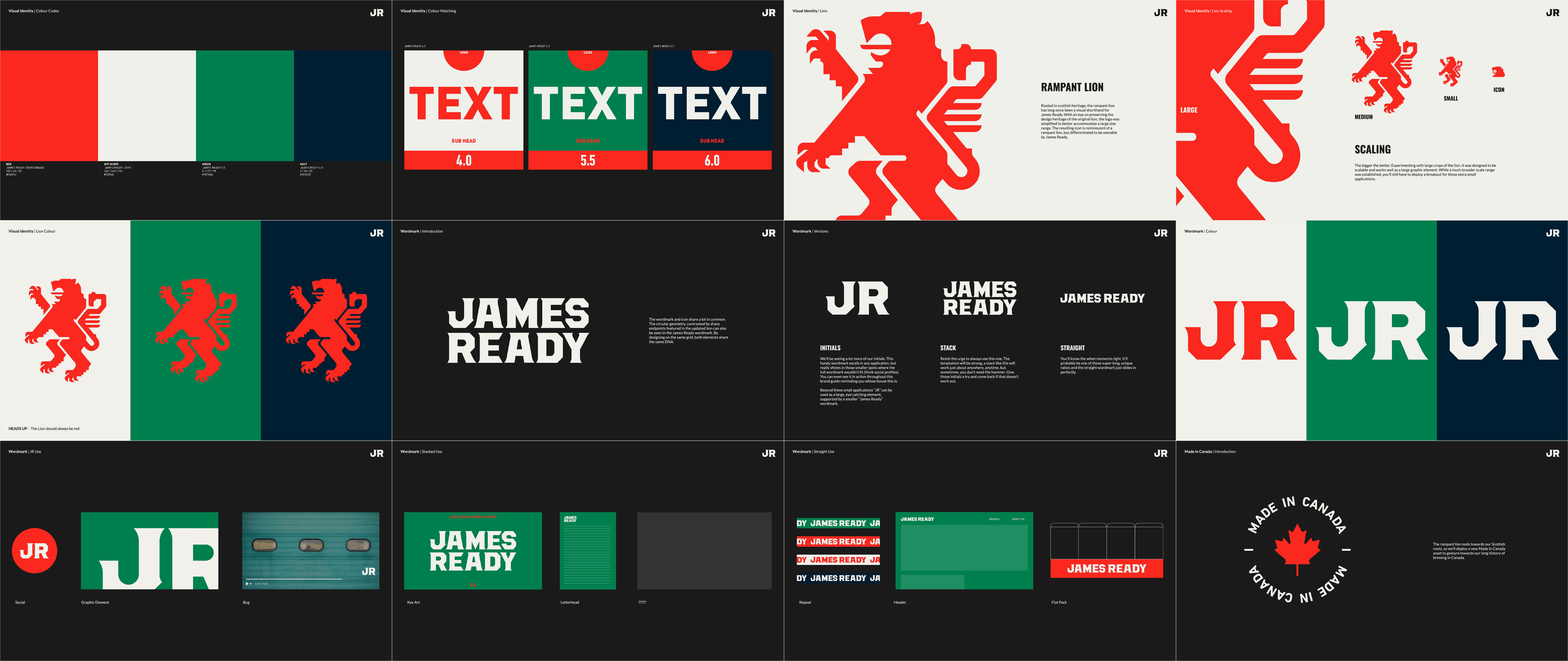
The roots of the new brand typography are firmly grounded in the visual landscape of brand marks and fonts found in rural Canada. James Ready’s visual language was designed to tap into an aesthetic that resonated with our demographic, one they not only recognize but also desire to be associated with. Based on the Brothers typeface (designed by John Downer), we evolved the letterforms to align with the visual language of our newly redesigned rampant lion. The proportional relationships between rectilinear volumes, circular geometry contrasted by sharp endpoints, and grid-based design within the lion are mirrored in the anatomy of this evolved brand typography, creating a distinct visual relationship that harmonizes the new JR branding.
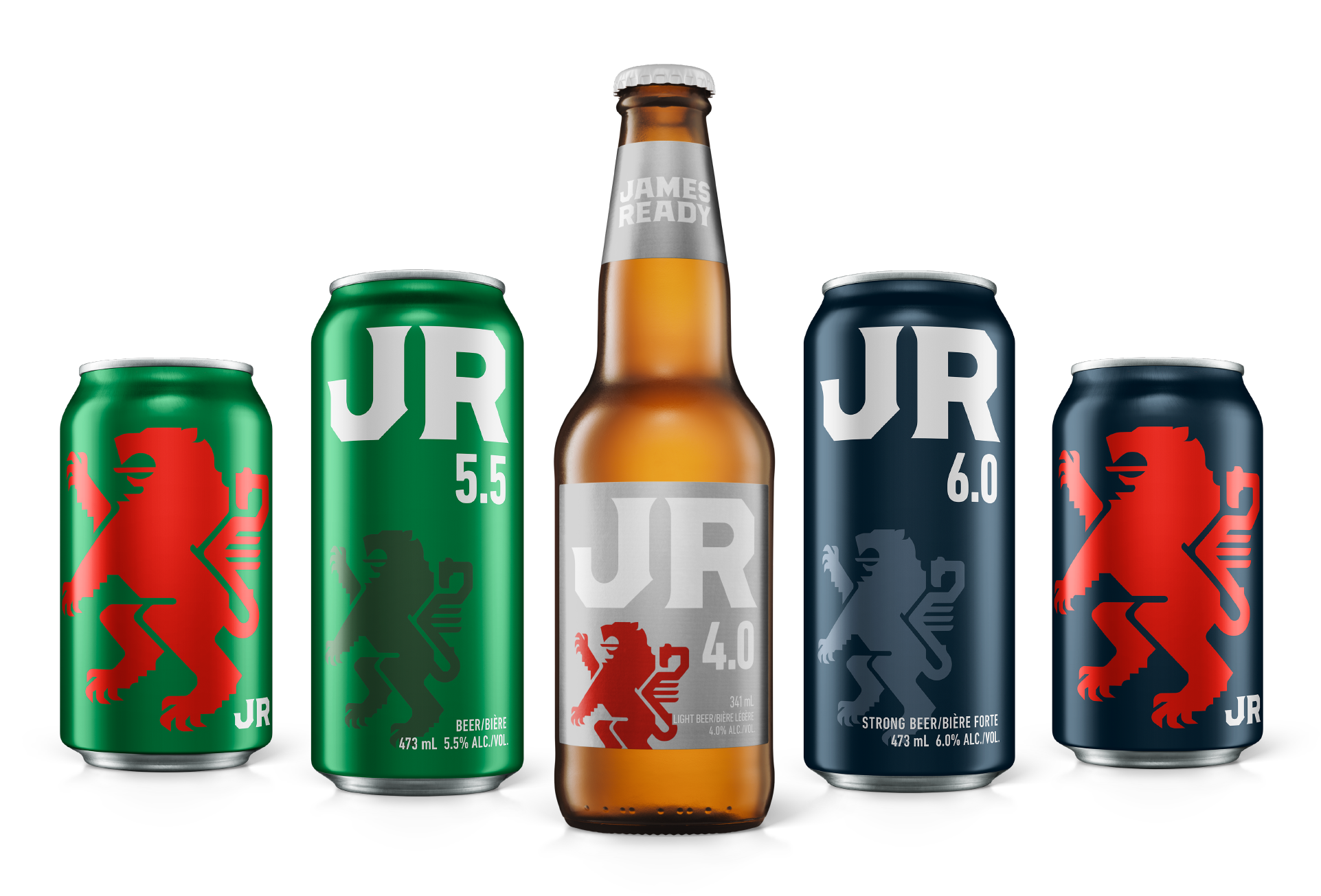
Whether stocked as singles in a beer fridge, stacked in flats, or buried under ice, JR is easy to spot and from any angle.


